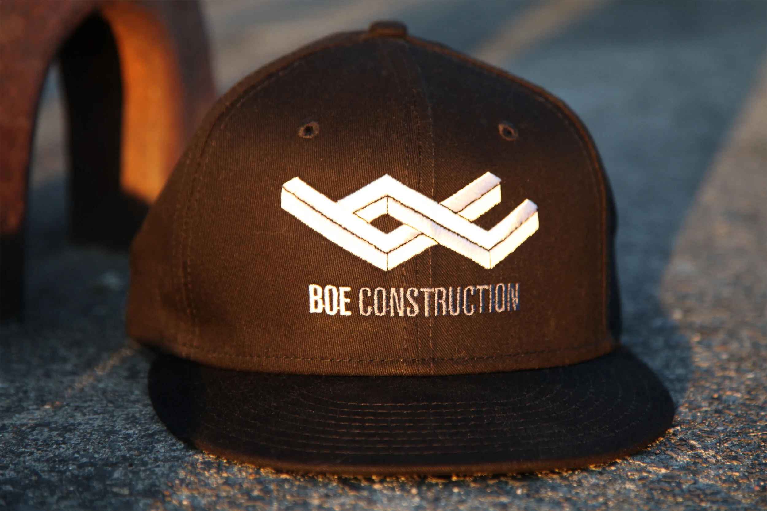
Below is a process that I went through to co-design a logo for my friend Derek’s construction company, Boe Construction. Derek already has a successful custom home building company, but he needs a separate company with its own brand and autonomy for the actual construction. As a home designer, he has a lot of good design ideas. He has an idea for his logo and says he’ll text it to me.
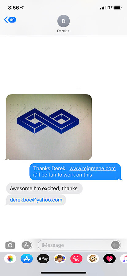
DerEk’s Text
This is his idea for his logo.
So after I get the text, I take a minute. I half expected Derek to send me the company’s initials in a block serif. Not this. I mean, this shape is fantastic, but I don’t know what to do with it. It doesn’t communicate a specific identity, yet it has something going for it. It presents an ideal structure, and that’s perfect for his brand. The wordmark can take care of the identIty.
But then I start to see letters in the shape. There’s a lower case b, and there’s part of a c. I want to dive in. I feel like I can make something work.
I check in with Derek. Let him know that I’m on top of it.
I bring the shape into Illustrator and start messing with it. Earlier, Derek had insisted that Boe Construction has to be fully spelled out. I have a feeling about Bebas Neue before I even begin. It’s tall. It’s naturally condensed, and that will help accommodate all of the characters.
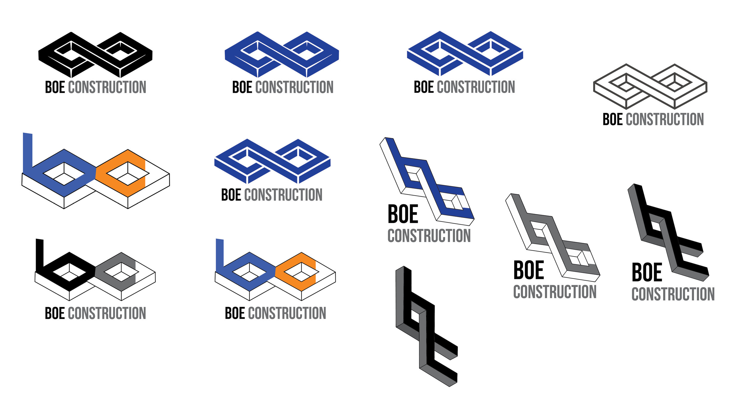
I feel like I’m successfully working with the form, but it’s not alive yet. It’s been a day, and I show Derek what I have. He likes the direction, but he’s not sure about the stacked type and the vertical orientation. His assistant loves the execution in the lower left. He wants the one in the upper left. I let him know that I can develop some more ideas based on the feedback. He’s all for it, and because he feels he already has something that will work, he tells me to “go for it” and to “geek out.”
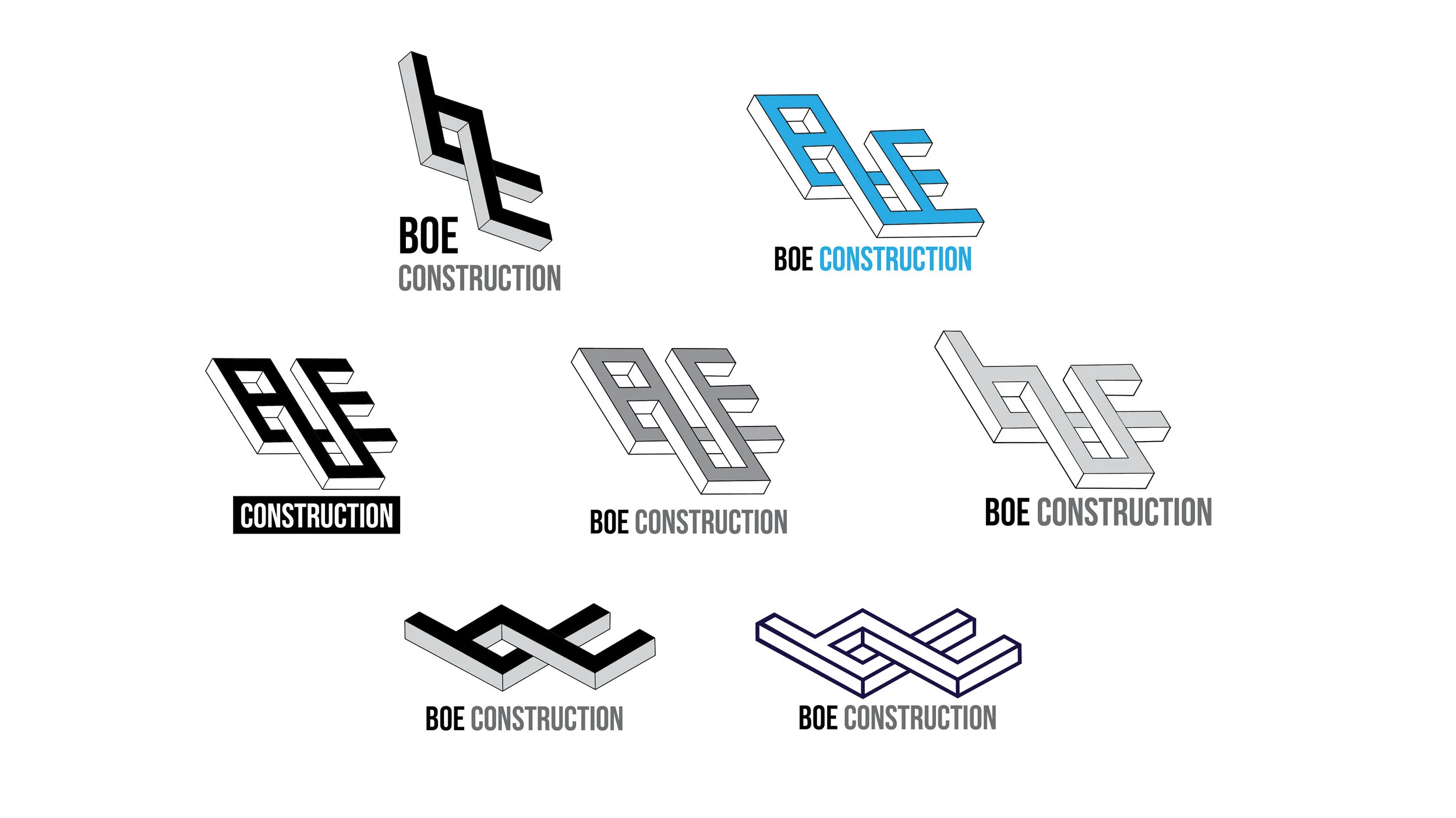
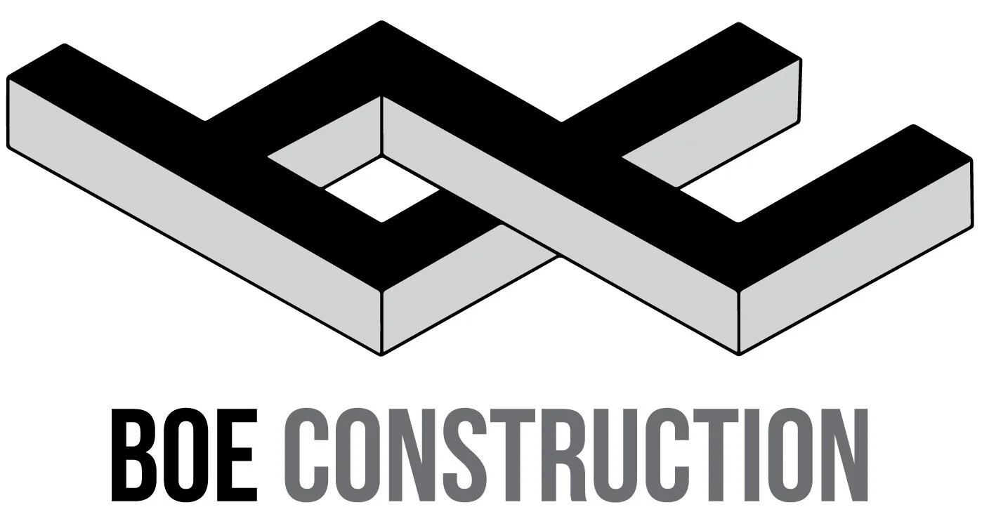
I start manipulating the form a lot more than in the first round. But then I bring it back. I show Derek and he’s excited about the execution in the lower left. He takes a day to think about it. Then a night. He asks his wife. He asks his assistant. Meanwhile, I start feeling the same way about the execution in the lower left. The b and the c are clear. It’s not too far from the form of the original shape. It’s the most simple and clear idea. I’d also like to develop the executions in the middle row. But, when I check in with Derek, we finalize the logo in the lower left. It’s his company. It’s his name. I get it.
After we have the logo, the first order of business is getting shirts and hats for the crew and branding his vans and trailers. I teach Derek’s assistant, Ryan, a little bit about design files. I also tell them that I’m happy to create a style guide. “A what?”
I make a master folder containing every combination of clear, black, gray, and white that I can think of. I include the native files as well as JPG, PNG, EPS, and PDF.
